— A Completely Different Animal
Rooster Teeth
MY ROLE
Identity Design
Brand Architecture
Campaign Creative
Motion Design
YEAR
2022–2023
CLIENT
Rooster Teeth – Warner Bros. Discovery
PROJECT TEAM
Creative Agency: Guerilla Suit
Strategy: Hannah Young
Account Team: Hannah Young, Julie Warenoff
OVERVIEW
Welcome to the most random place on the internet. When they aren’t making themselves laugh, Rooster Teeth is hard at work making content about, well, anything they’re into. Their island of misfit shows is a collection of their latest obsessions, channeled into podcasts, live streaming, practical jokes, animated shows and everything in between.
Press play to say farewell to the old logo.
The original rebus-style logo came with a massive portfolio of content and 20 years of history to unpack. Buried under all the history is a company uniquely aligned.
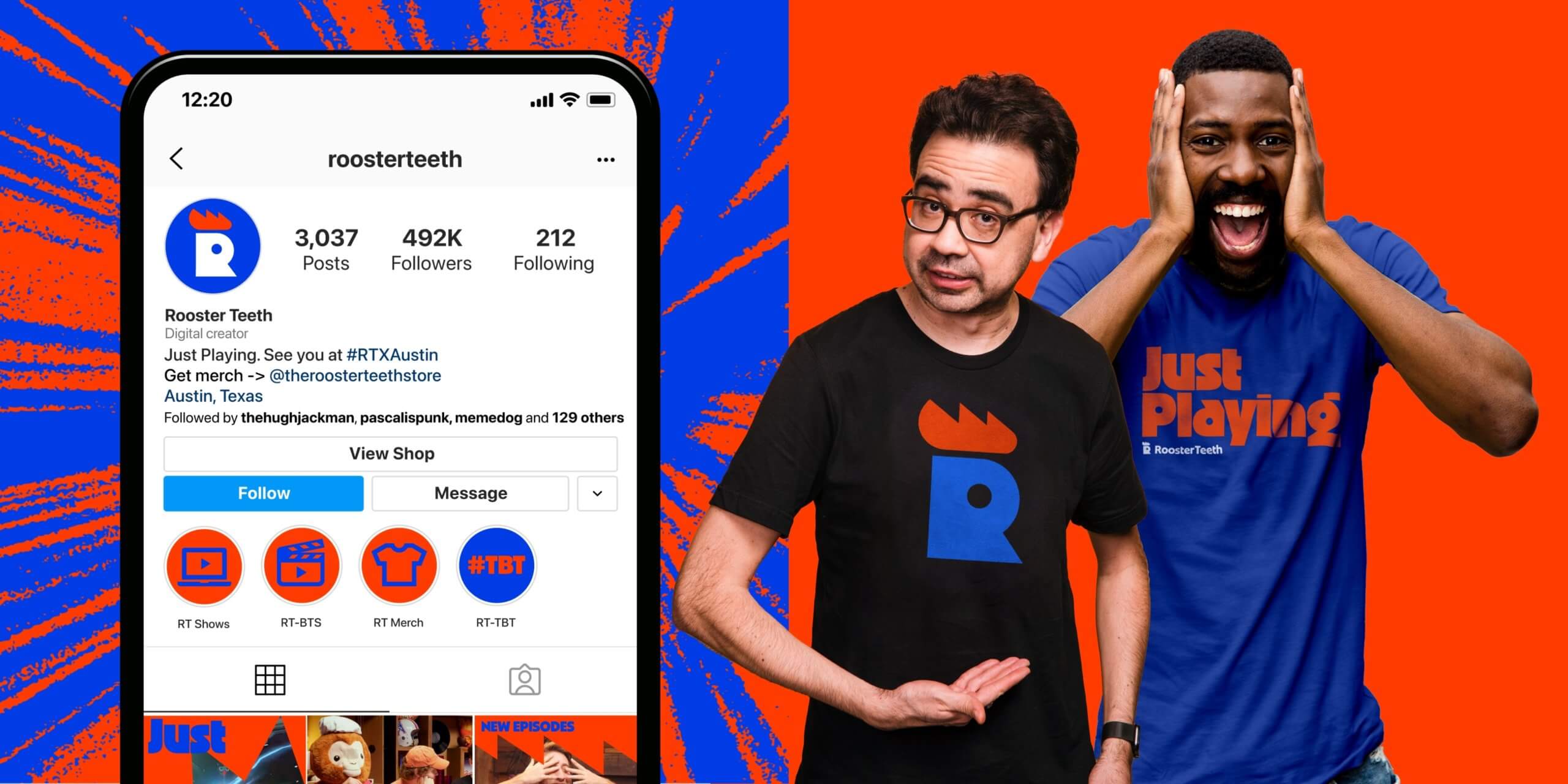
The Rooster Teeth team is united by making things they love for their fans who love what they make. A refresh to the brand would give them a head start on the next 20 years with a much needed new look to rally around.
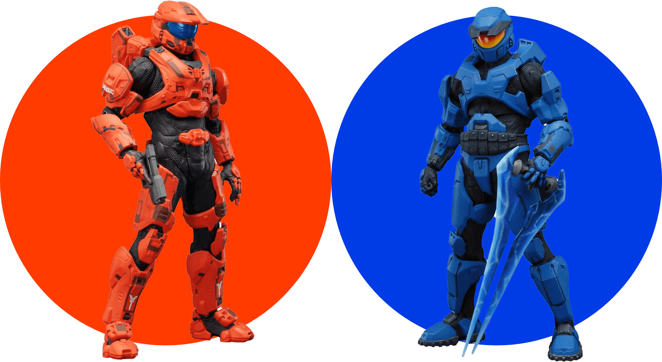
Red vs Blue
Evolving the original red brand color was only half the story we wanted to tell. As we developed the color palette an unconventional pairing revealed itself — a color combination that Rooster Teeth had laid claim to since the very beginning.
The Bite
The “teeth” from the original logo, represented by wind-up chattering teeth, have been reintroduced as an animated “bite”. The bite can be used as a transition element or as a sign off.

00:20 — 20th Anniversary Brand Reveal Video
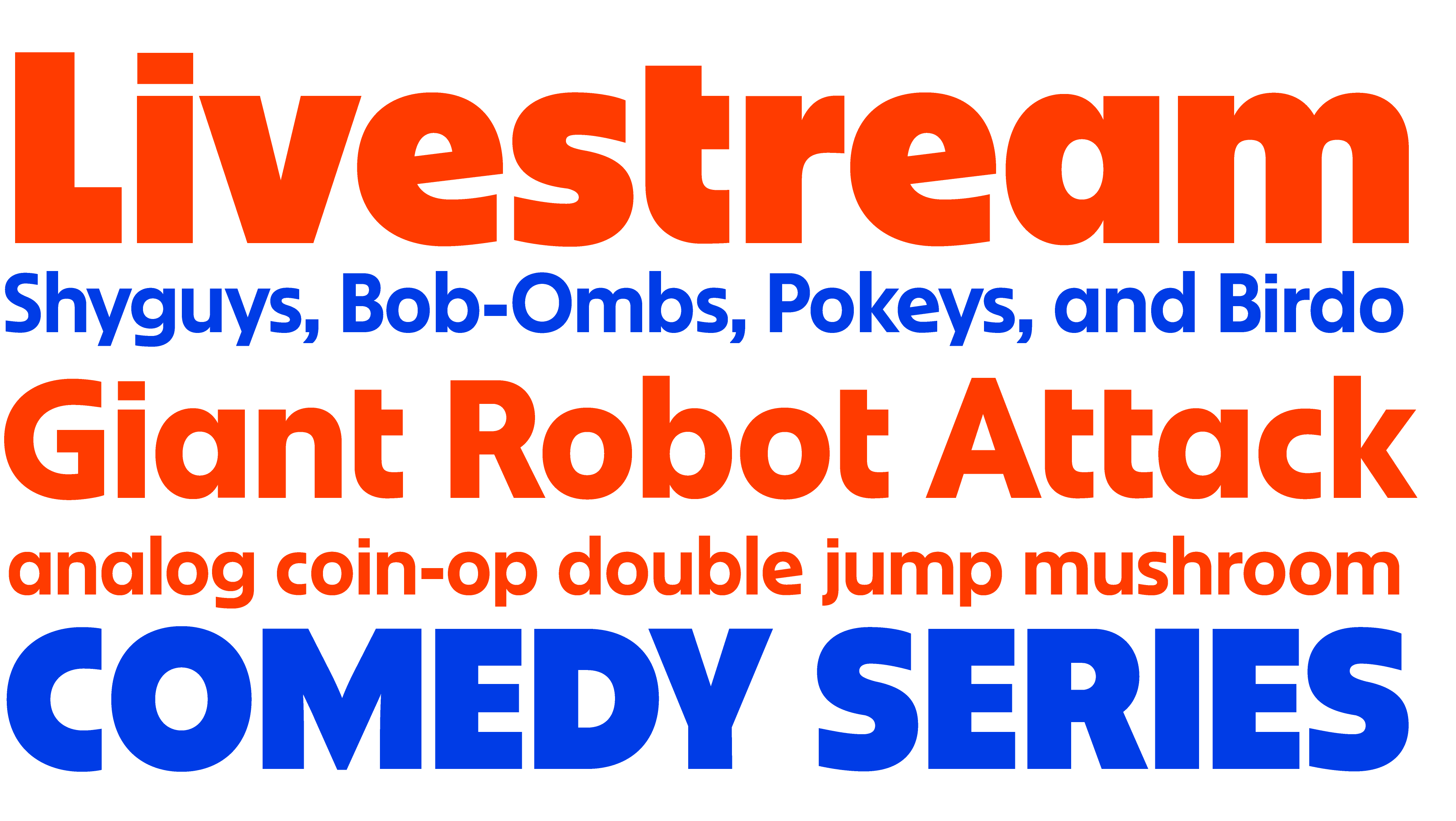
Nuform Sans
The charmingly retro Nuform Sans, designed by Erik Marinovich, was chosen to compliment the wordmark and amplify the brand's quirky tone of voice. Nuform’s big brother and display counterpart, Ozik, is used for large, punchy headlines.
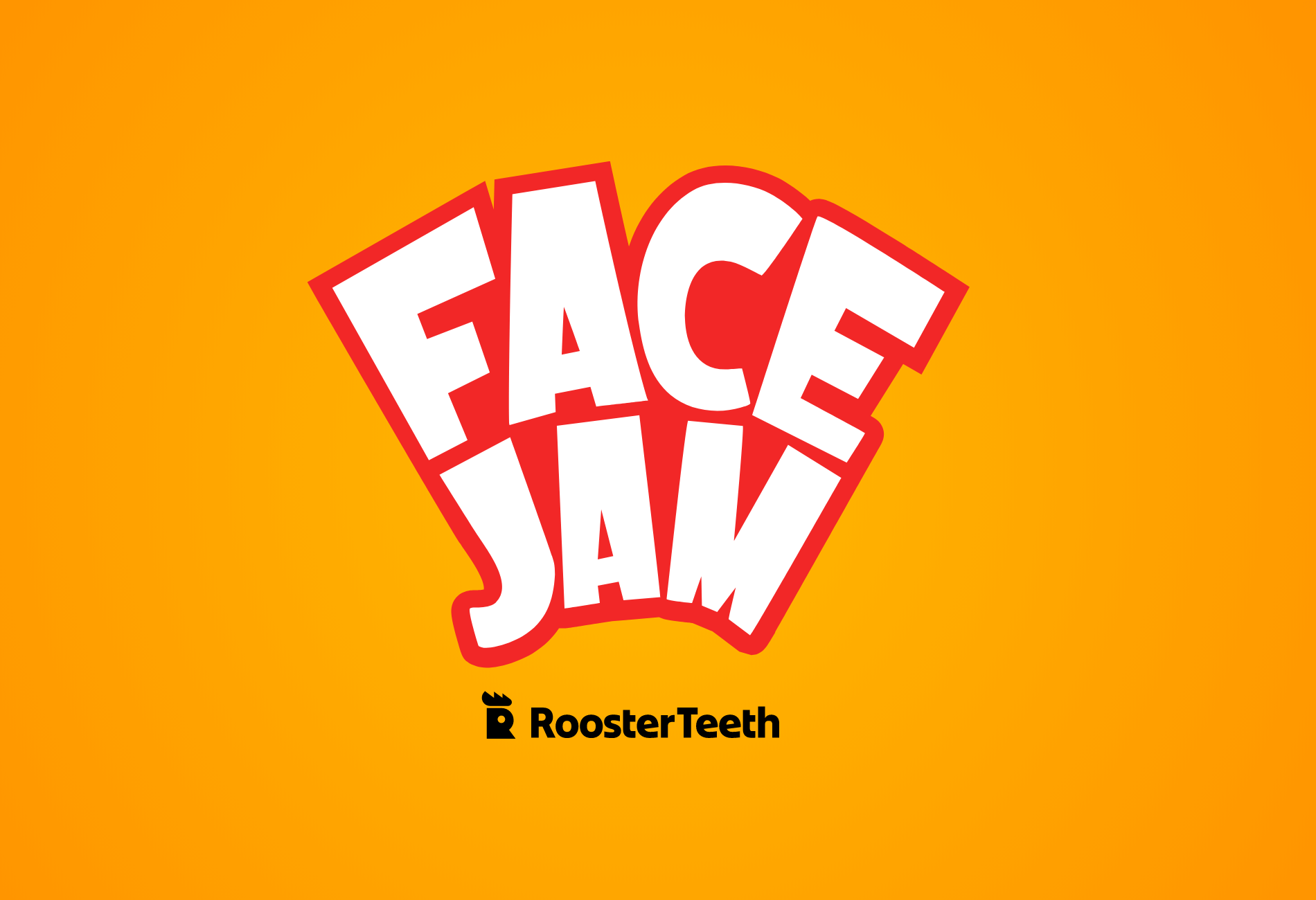
The Sub-brands are the Brand
For the rebrand to truly resonate, Rooster Teeth would need to rethink how they engage their creator-loyal audience moving forward. Our approach was to develop a simple endorsement system for each sub-brand logo, ensuring a clear connection to the parent brand. The result? A brand architecture that allowed each sub-brand to shine on its own while still being unmistakably part of the Rooster Teeth family.