
— Unifying a Growing Brand
SXSW Rebrand
MY ROLE
Creative Direction
Identity Design
Brand Architecture
Business System
Guidelines
YEAR
2017
CLIENT
SXSW, Inc.
PROJECT TEAM
Creative Agency: Foxtrot
Brand Strategy: Jann Baskett
Digital Strategy: Brad Phillips
Account Team: Vicki Webster, Mo Serrao-Cole
Designers: Oscar Morris, Mike Valentine
UX Design: Edna Rodriguez
OVERVIEW
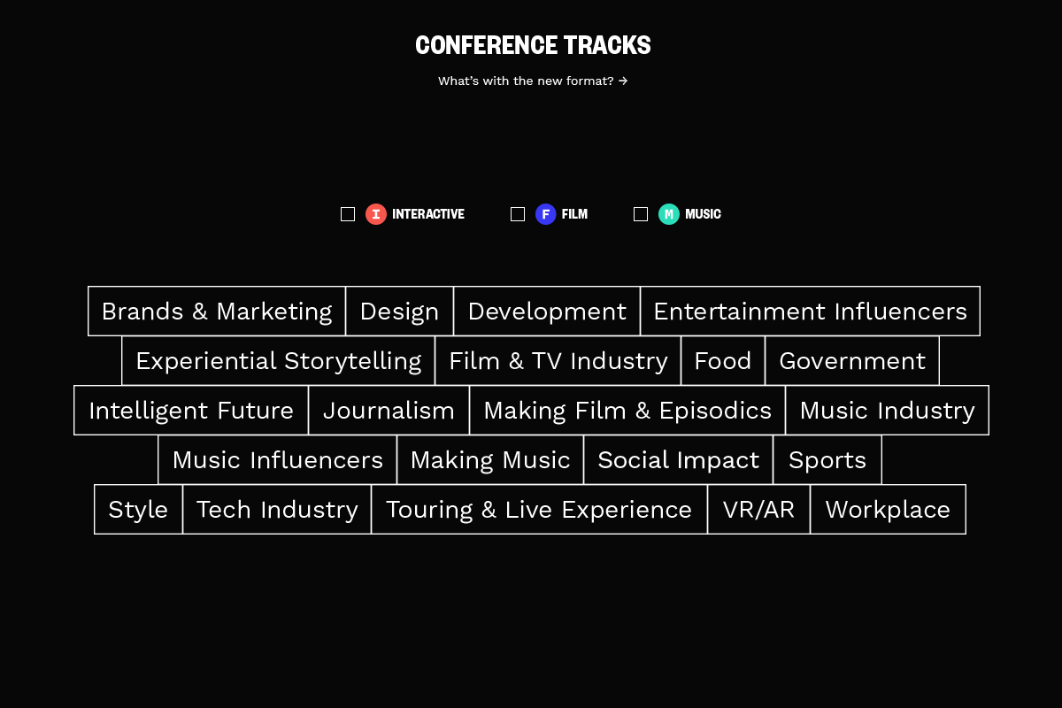
As SXSW grew year after year, the number of events, competitions, exhibitions, topics, and festivals all competing for attention grew as well. A new identity system and consistent framework was needed.

Original silkscreen poster for the first SXSW conference held in 1987. Designed by Nels Jacobson.
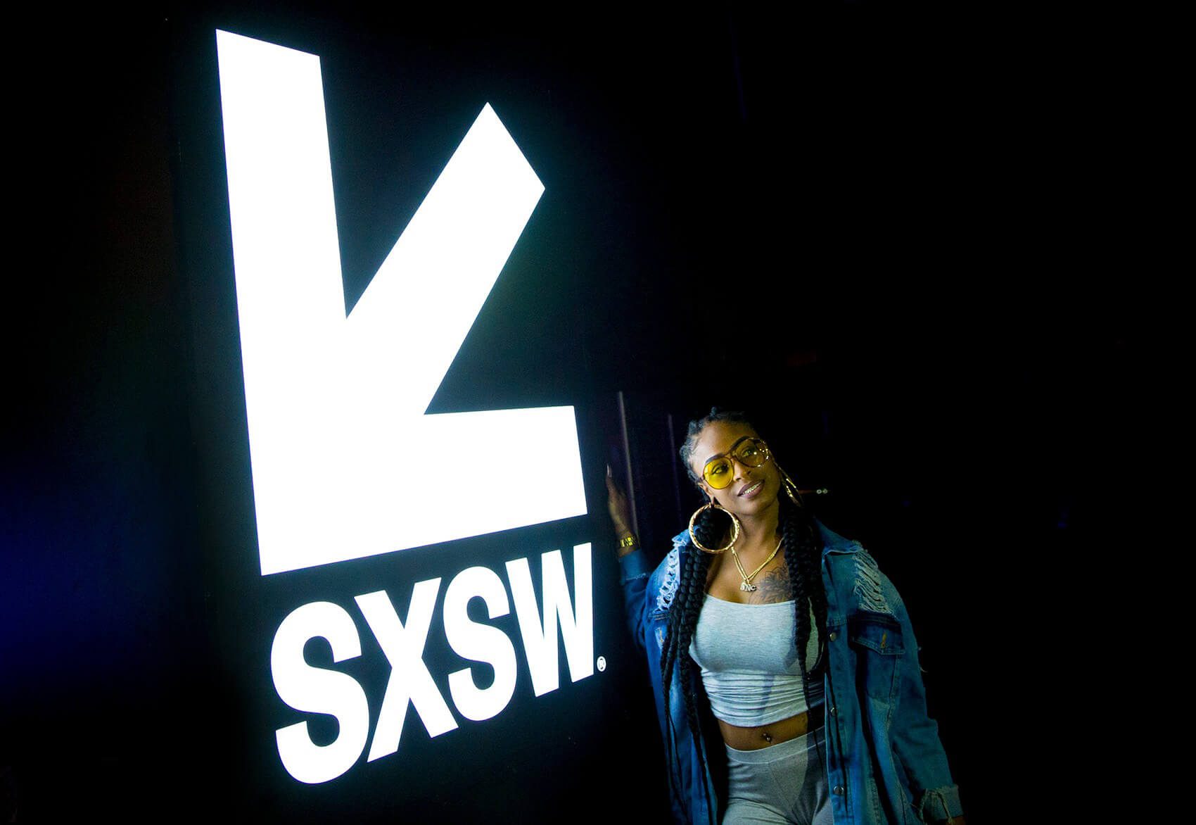
Down & To the Left—
An element that features prominently in the redesign is a southwest pointing arrow. An arrow design had been around in one form or another since 1987, the very first year of SXSW. It survived 30 years of redesigns and trends popping up in various places with each year’s look and feel.
This piece of meaningful history would find new life in the larger system by taking a leading role in the identity.
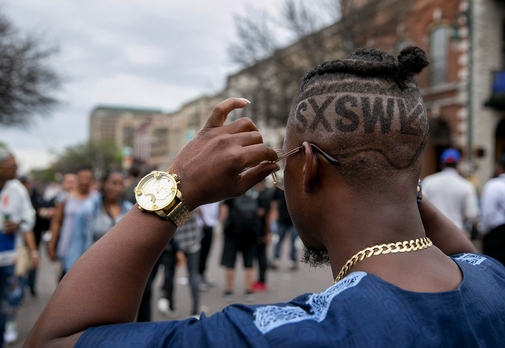

A Growing Brand—
The exponential popularity of SXSW propelled the event to reach new audiences through events, competitions, exhibitions, topics and festivals.
With so many options and little time, an unified identity became essential for organizers and attendees alike.
A Dynamic Grid—
To eliminate the burden of reinventing the typographic system annually or redesigning complex logo lockups each year, the rebrand would have to aspire to more than a logo update.
A larger design system that would account for a growing number of events, competitions, exhibitions, and festivals was created.

The entire system uses Founders Grotesk from Kris Sowersby (Klim), a type family celebrated for its versatility. The bold condensed weight gives the brand a careful authority while the text weights add a dash of quirkiness without compromising legibility.

A Unified Brand—
For the SXSW organization the unified identity system provides a clear, consistent framework around which ideas and opinions can be expressed without the brand getting in the way.
This systematic approach naturally acts as wayfinding both digitally and in signage year-to-year.
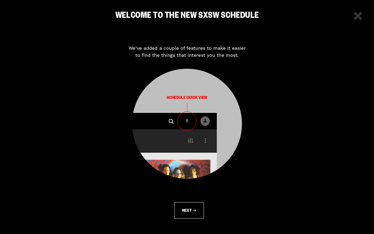
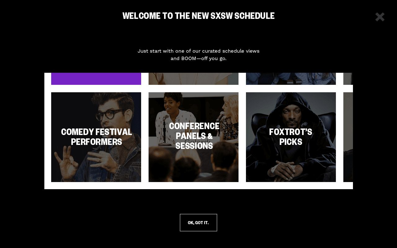
A Digital Overhaul—
Prior to the redesign, both the identity and website primarily addressed the needs of promoting the Music, Film, and Interactive conference and festivals as three distinct offerings.

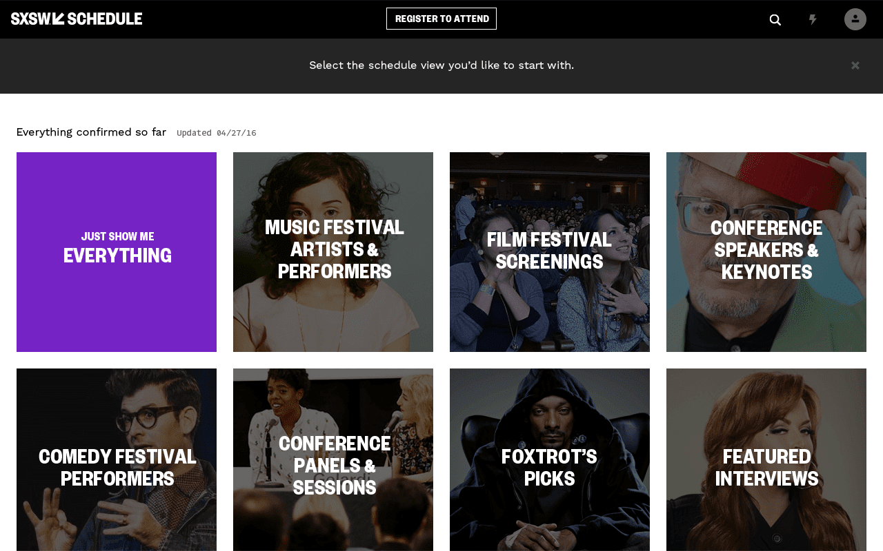
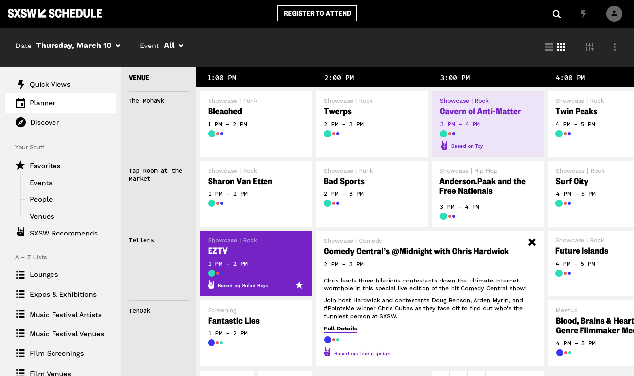
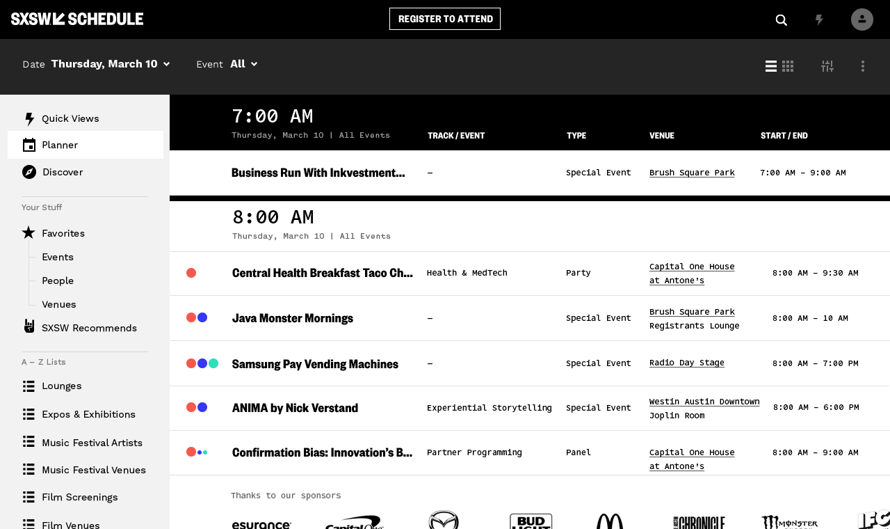
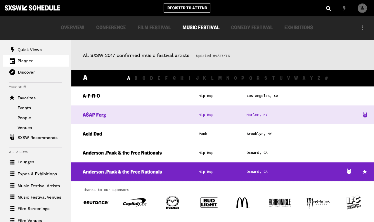
The new design would center around a bold reimagining of the schedule to give SXSW new exciting ways of highlighting emerging topics and trends that are essential to the SXSW experience.


© 2026
Let's Talk — Email